Like Instagram and vscocam, Lightroom apparently also has an option to add a little color to photographs. Obviously not a feature for those who like something called "realism", but I've never felt constrained by the idea that photographs must directly resurrect the moment they've captured.
I've been attempting to pick at least one shot from some memorable weekends, trips, and events to play around with. Here's the first batch, organized somewhat by descending rainbow order:
 |
f/4, 1/60th, ISO-100, 18mm
Purple lake view |
 |
f/2.8, 1/50th, ISO-200, 17mm
Swing around the bride |
 |
f/4, 1/2500th, ISO-100, 50mm
Using color to make a gray day slightly more interesting
Not sure this is the right color for it, probably has too much sky and therefore too much periwinkle |
 |
f/3.2, 1/125th, ISO-1600, 50mm
mmmm cake
This is an example of the color being used as an attempt to cover up aspects I don't like |
 |
| f/3.2, 1/1600th, ISO-200, 17mm |
 |
| f/4, 1/1250th, ISO-100, -1 exposure, 28mm |
 |
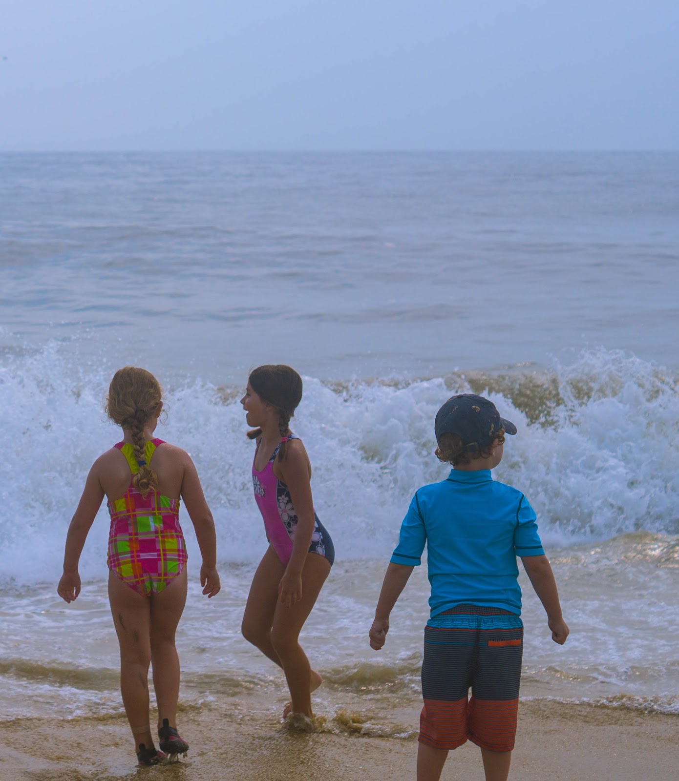
| f/5.6, 1/2500th, ISO-1600, 22mm |
 |
| f/4, 1/160th, ISO-1600, 60mm |
 |
f/3.2, 1/400th, ISO-400, 17mm
We take the Nationals very, very seriously. |
 |
| f/5.6, 1/1600th, ISO-1600, 28mm |
 |
f/4, 1/200th, ISO-100, 70mm
Retro 'rents |
 |
f/1.8, 1/4000th, ISO-100, 50mm
I find that for some shots, the color augments the photo, as opposed to covering up mistakes |
 |
f/1.8, 1/250th, ISO-200, 50mm
|
 |
f/1.8, 1/4000th, ISO-100, 50mm
sometimes I see the world through rose colored glasses |
Coming up soon: some remaining favorite summer shots and another round of black and white photos from the last few months.


Comments
Post a Comment